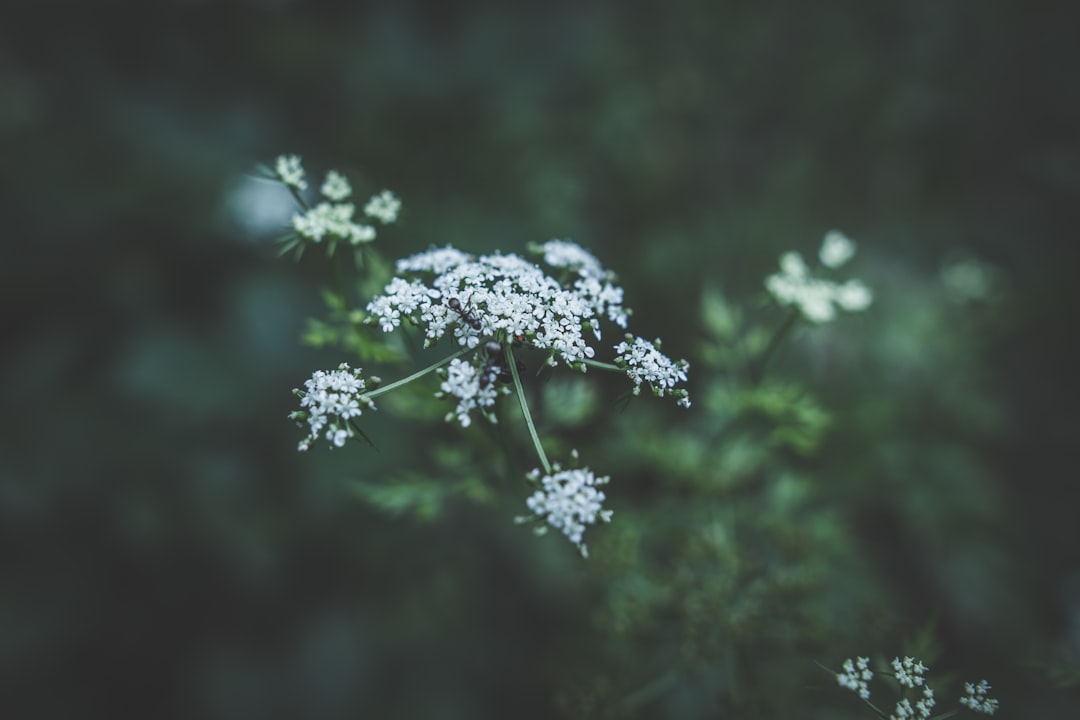
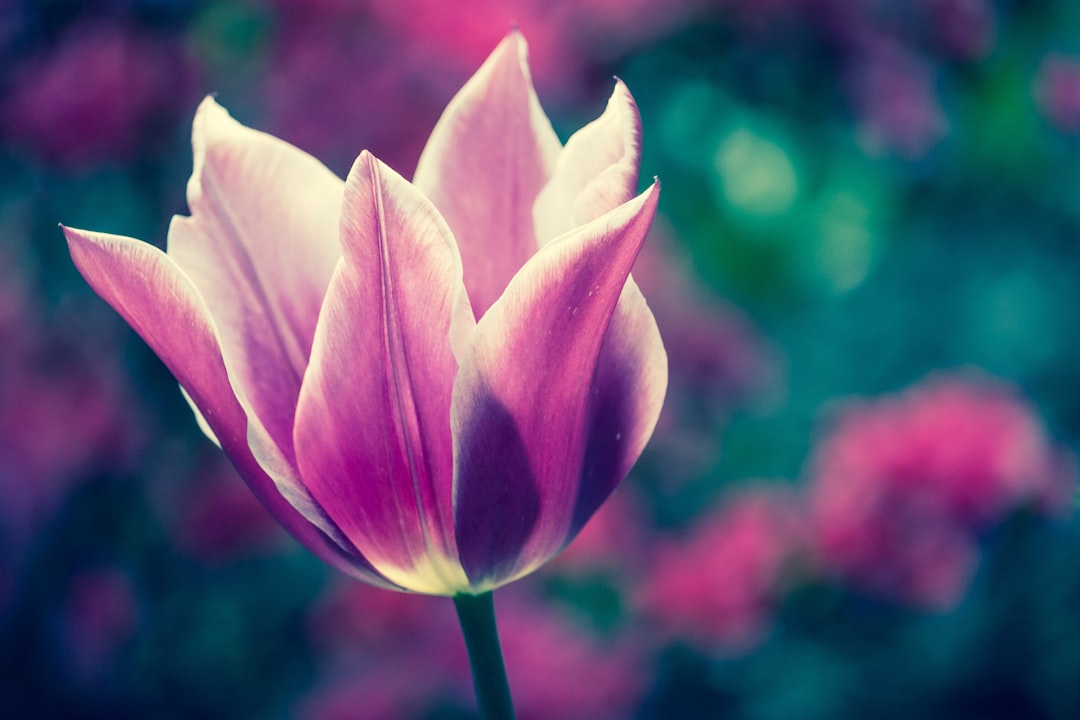
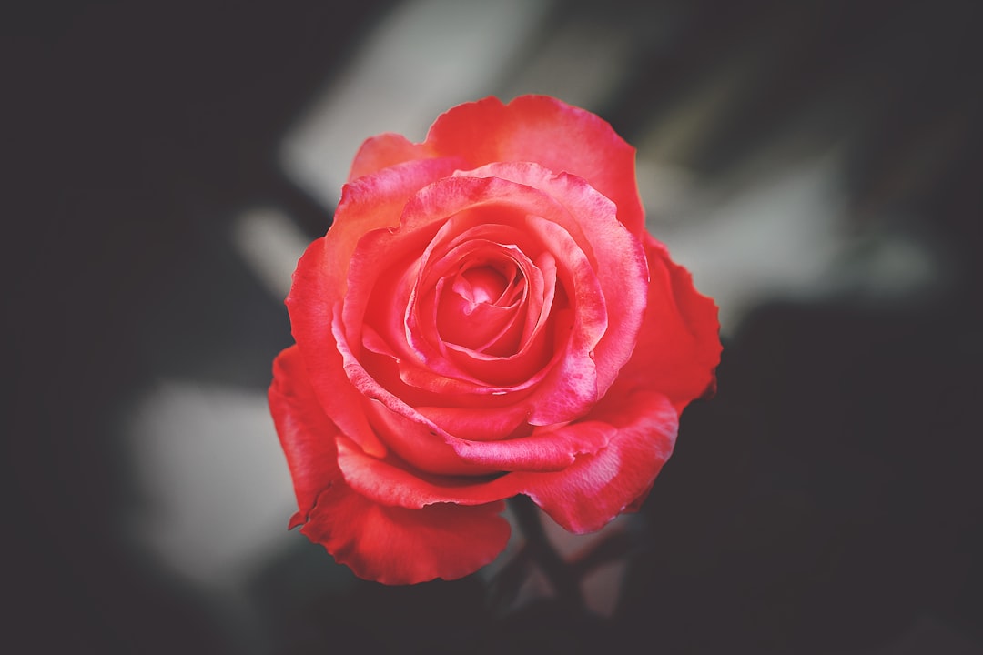
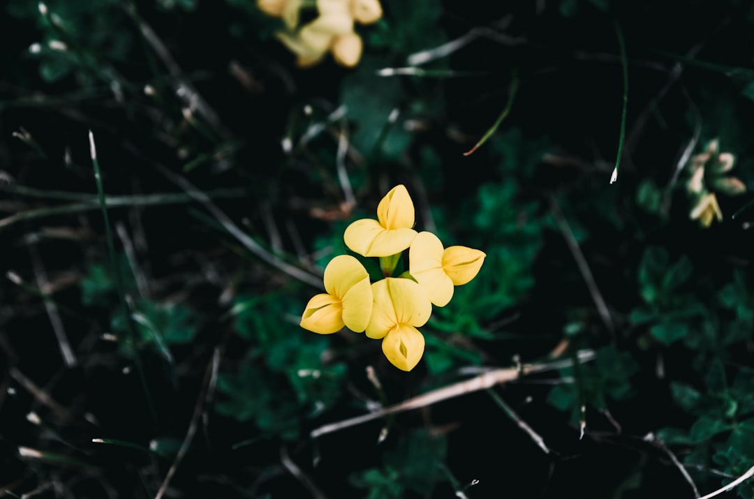
Gallery#
With %%gallery you can view image collections. All images are resized the same width but keep their aspect ratio. They are ordered horizontally, from left to right, then top to bottom. White space is added to fit the images of the next row. You can display the image collection either with or without a white frame. (gutter)
The number of images that are shown is automatically adjusted to the available screen width.
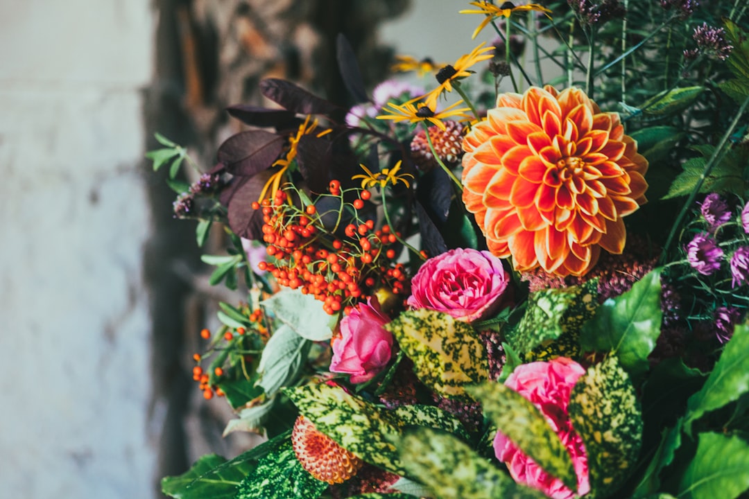
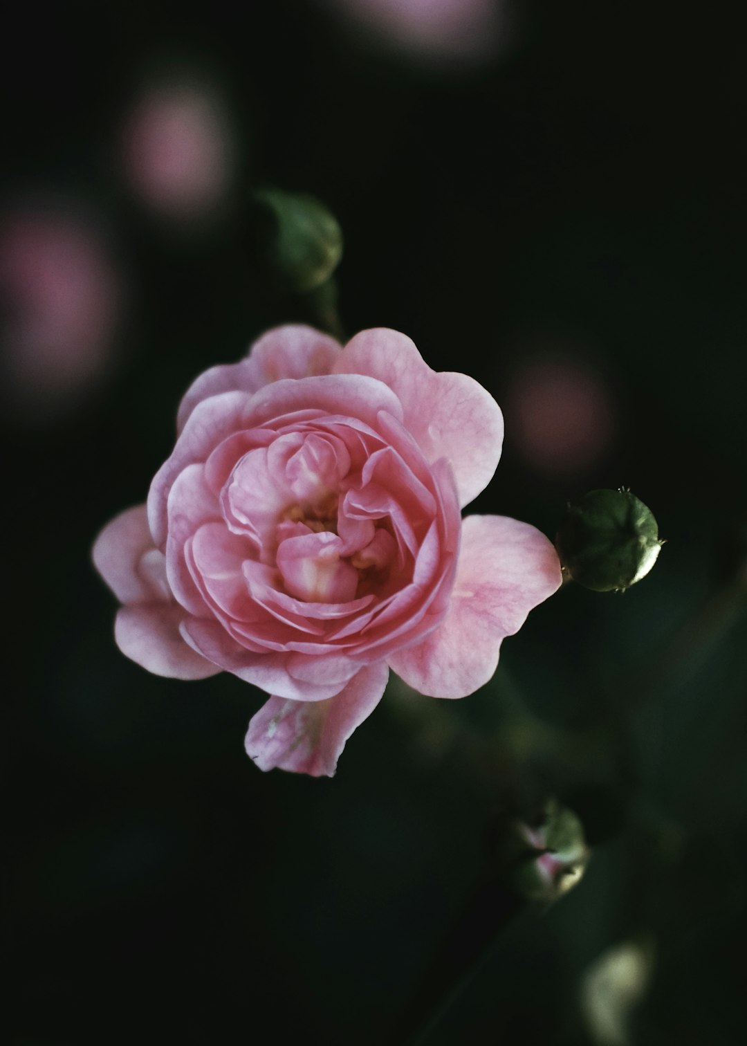
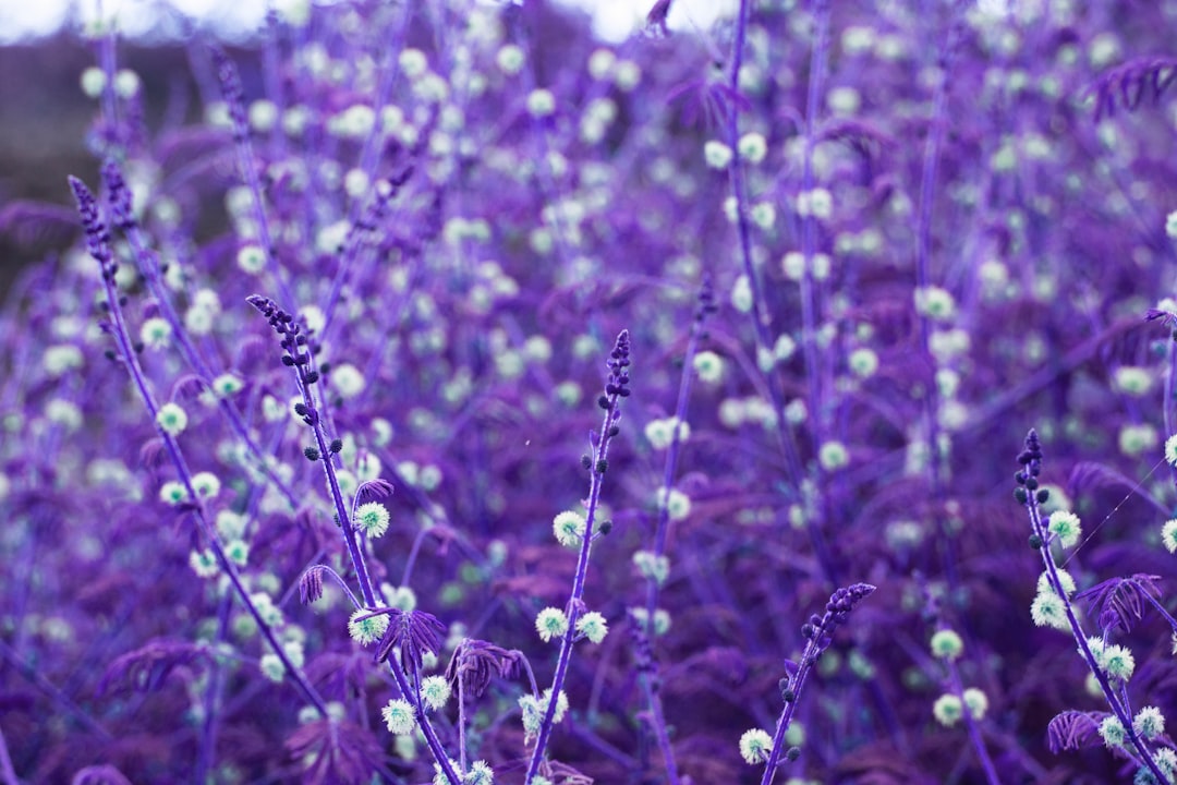
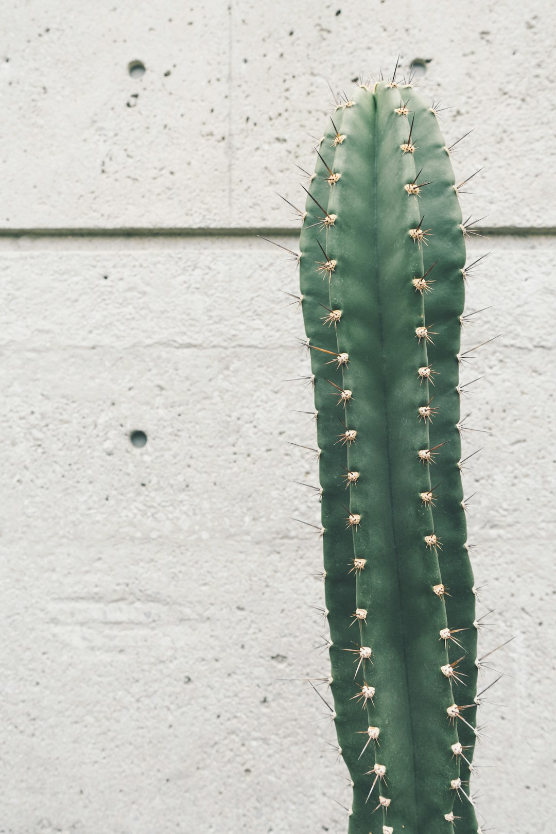
Free high-resolution photos from Unplash .
.
With gutter#
%%gallery <links to images> /%
 |
 |
 |
 |
 |
 |
 |
 |
 |
 |
 |
 |
 |
 |
 |
 |
 |
 |
 |
 |
 |
 |
 |
No gutter#
%%gallery.nogutter <links to images> /%
|
|
|
|
|
|
|
|
|
|
|
|
|
|
|
|
|
|
|
|
|
|
|
With Background#
%%gallery
  [{Image src='background image' class='bg'}]
  <links to images>
/%
|
|
|
|
|
|
|
|
|
|
|
|
|
|
|
|
|
|
|
|
|
|
|
|
/* landscape smartphone */ @media (max-width: 480px){ .gallery .imageplugin { float:none; } } /* tablet */ @media (min-width:481px) and (max-width:768px){ .gallery img.inline, .gallery .imageplugin { max-width: calc(100%/2 - 1em*1/2); } .gallery.nogutter img.inline, .gallery.nogutter .imageplugin { max-width: calc(100%/2);} .gallery img.inline:not(:nth-child(2n)), .gallery .imageplugin:not(:nth-child(2n)){ margin-right:1em; } .gallery img.inline:nth-child(2n+1), .gallery .imageplugin:nth-child(2n+1){ clear:both; } } /* desktops only */ @media (min-width:769px) and (max-width:980px){ .gallery img.inline, .gallery .imageplugin { max-width: calc(100%/3 - 1em*2/3); } .gallery.nogutter img.inline, .gallery.nogutter .imageplugin { max-width: calc(100%/3); } .gallery img.inline:not(:nth-child(3n)), .gallery .imageplugin:not(:nth-child(3n)){ margin-right:1em; } .gallery img.inline:nth-child(3n+1), .gallery .imageplugin:nth-child(3n+1){ clear:both; } } /* large desktops */ @media (min-width:981px){ .gallery img.inline, .gallery .imageplugin { max-width: calc(100%/4 - 1em*3/4); } .gallery.nogutter img.inline, .gallery.nogutter .imageplugin { max-width: calc(100%/4); } .gallery img.inline:not(:nth-child(4n)), .gallery .imageplugin:not(:nth-child(4n)){ margin-right:1em; } .gallery img.inline:nth-child(4n+1), .gallery .imageplugin:nth-child(4n+1){ clear:both; } }
See Category.Add CSS Style, Image Styles, Image Masonry, Image Quilt
 );
background-repeat:no-repeat;
background-position:top;
background-size:48px;
text-align:center;
}
);
background-repeat:no-repeat;
background-position:top;
background-size:48px;
text-align:center;
}