Images with style
cool effects, transformations, frames and more
This works in the
Haddock Template.
Image styles allow you to add special effects, transformations, animation, frames, captions etc. to photographs and images. It is also possible to combine multiple styles with the . separator.
Markup:
%%<style1>.<style2> [<wiki-page>/<image attachment>]/%
%%<style1>.<style2> [{Image src='<image url>' }]/%
[{Image src='<image url>' class='<style1> <style2>'}]
Note: most images styles can also be used on
background images.
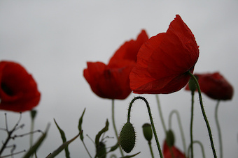
Basic styles#
Note: hover your mouse of the image for a smooth transition to the original image.
original
 |
light
|
dark
|
grayscale
|
invert
|
sepia
|
contrast-2
|
contrast-10
|
saturate-2
|
saturate-8
|
hue-rotate-1
|
hue-rotate-2
|
hue-rotate-3
|
brightness
|
blur
|
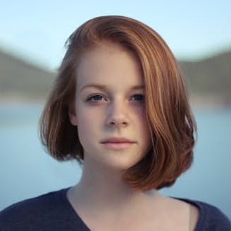
Flip#
Flip the image vertically or horizontally (or both).
original
|
fliph
|
flipv
|
fliphv
|
Blend#
Blend the image color with the background.
Frames#
Frames (rounded, circle) can be used flat or raised. (with shadow)
Original
 |
rounded
|
circle
|
img-thumbnail
|
raised
|
rounded raised
|
circle raised
|
img-thumbnail raised
|
Captions#
With the
Image Plugin you can add a caption to an image. It can be styled as a text balloon (
%%caption-arrow) or overlayed on top of the image (
%%caption-overlay) . Note that the
%%caption- style must be set around the Image.
%%caption-arrow
[{Image src='<image>' caption='<caption content>' }]
/%
No caption
Default caption
bear
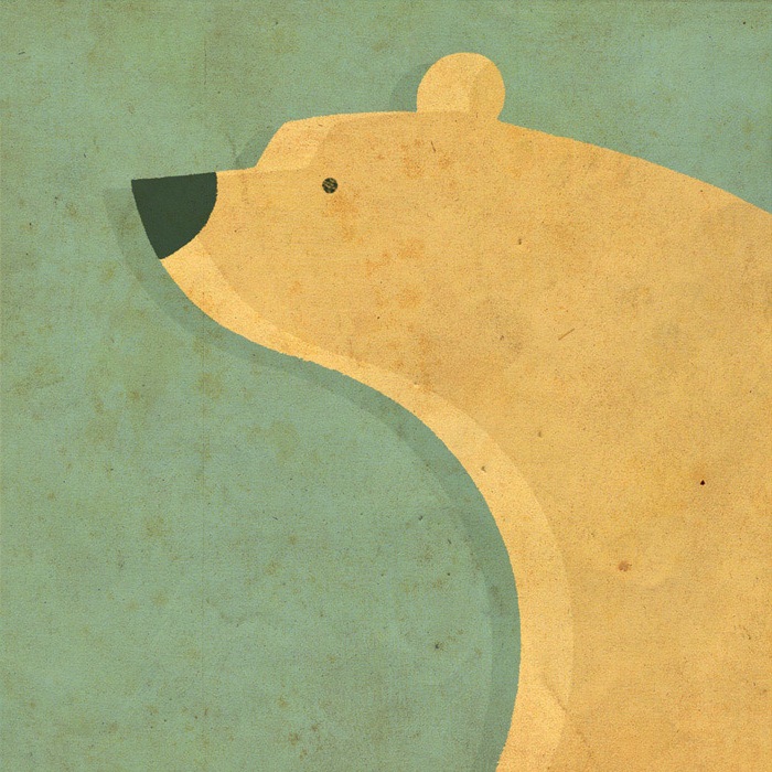 |
Caption-arrow
bear
|
Caption-overlay
bear
|
Normally, caption content can only consist of text. If you need more freedom to the type of content and the styles you want to put in a caption, use the %%caption style.
Put the caption content right after the image. This is supported both for the Image Plugin as well as for inline attachment images.
%%caption
[{Image src='<image>' }]
More __caption__ content
/%
%%caption
[<wiki-page>/<inline image attachment>]
More __caption__ content
/%
No caption
Default caption
Caption-arrow
Caption-overlay
No caption
Default caption
Caption-arrow
Caption-overlay
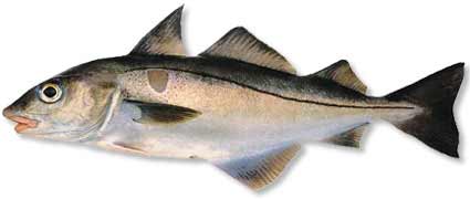
Magnify#
Add a magnifying glass to reveal details of a cropped image.
Hover the mouse above the image to see the effect.
%%magnify <your image> /%
[{Image src='<image>' class='magnify'}]
Or set a page-style at the top of the page to add the magnifier to all the images of the page.
[{SET page-styles='magnify'}]
Animation#
The animated %%kenburns effect is a type of panning and zooming effect used in video production from still imagery. The name derives from extensive use of the technique by the American documentarian Ken Burns
%%kenburns [<wiki-page>/<inline image attachment>] /%
[{Image src='<image>' class='kenburns' }]
Summary#
Note: you need to include Instagram Filters for the additional image effects .
- light
- dark
- invert
- grayscale
- blur
- caption
- caption-arrow
- caption-overlay
- rounded
- circle
- raised
- img-thumbnail
- blend, blend2
- sepia
- brightness
- saturate-2, saturate-8
- contrast-2, contrast-10
- hue-rotate-1, hue-rotate-2, hue-rotate-3
- aden
- brooklyn
- clarendon
- earlybird
- gingham
- hudson
- inkwell
- lark
- lofi
- mayfair
- moon
- nashville
- perpetua
- reyes
- rise
- slumber
- toaster
- walden
- willow
- xpro2
- Y1997
/* simple image grid with hover effect to show original image*/
.poppy img:not([width]) { width:200px;}
.poppy table {float:left; margin-right:.5em; }
.poppy + * {clear:both;}
.poppy td:hover{
filter:none !important;
transform:none !important;
mix-blend-mode:normal !important;
}
.poppy td:hover:before,
.poppy td:hover:after { opacity:0; }
.poppy td {transition: 1s all;}
See also
Haddock Template,
Haddock Styles,
Instagram Filters,
Background Styles

 );
background-repeat:no-repeat;
background-position:top;
background-size:48px;
text-align:center;
}
);
background-repeat:no-repeat;
background-position:top;
background-size:48px;
text-align:center;
}